10 Elements of an Ugly Website
Do You Have An Ugly Website?
Every year, there are several PC and technology groups that come up with a list of the 10 worst websites of the previous year. Some of these are homemade experiments by those learning how to create a website, while others revel in their notoriety.
However, if your website is for business purposes, there are certain mistakes you DO NOT want in your web design. Whether you do it yourself or have someone else build it for you, here are the 10 pitfalls that can potentially make your website the butt of a global joke. Click on the images for links to the offending website (if you dare).
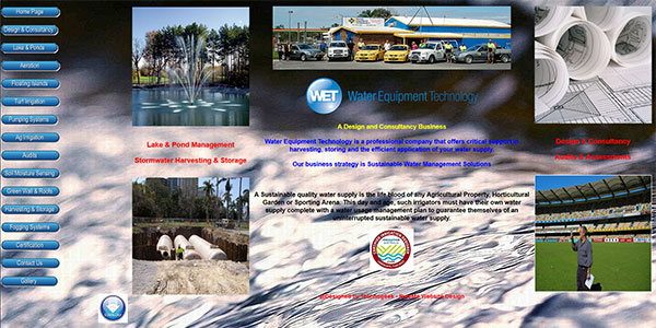
1) Colour Scheme
Yes, you want your website to be eye catching. But you don’t want it to be the catalyst for an electronically induced LSD trip. No neon rainbows or clashing colour schemes, please. For best results, choose basic black or white with one main colour and a touch (and I mean it, just a smidgen!) of an accent colour. Some of the best website designs use only one main colour, but use varying shades to make it interesting.
2) Animation
Sliders are good, flash is getting old quickly and clip art is just bad. If you have animated clip art on your website, you are telling the world that you refuse to grow up and move into the millennium. Clip art was used back in the 80’s when it was technologically advanced. We have moved on since then and so should you. (The Afterlife)
3) Music
No matter how sophisticated or mellow the tune (I’ve heard everything from Enya, to The William Tell Overture, to Gangsta’s Paradise by Coolio); you do not want music on your website. A large percentage of internet users do some surfing at work. Don’t misunderstand me, it’s not wrong to look for a dentist on your lunch hour or peruse a mood-lightening joke site during your coffee break. But when the visitor becomes the unwilling subject of the prairie dog stare (when heads pop up over the edges of the cubicle walls) at the sound of Beethoven in an alto key at concert hall volume, rest assured your website will never again be visited by that person or any of his or her friends. (Grand Dance Studio)
4) Too many focal points
You want visitors to your website to zero in on your main message – ONE main message. If internet users find their vision darting around as though they are watching a 40-man ping pong tournament, you need to re-think the purpose of your home page. (Ling’s Cars)
5) Distracting Background
Patterns, and pictures, and motion. Oh, my! You want your visitors to focus on your message, correct? So why waste their time by making them stare at your website trying to figure out what’s up with that background. A good website design should automatically draw the visitor’s eyes to the center of the page, to the main message. No paisley, no tiled (repeated) graphics, no blinking or flickering, please.
6) No graphics at all
Lots of us enjoy reading, but when we want information, and want it quickly, scrolling through endless text can not only be mind-numbingly boring, but it keeps the visitor from getting your message quickly, which is exactly what you want them to do. A well-balanced site with text and complementary graphics helps visitors interpret your message quickly, and keeps them interested enough to want more information.
7) Lack of readability
Too many different font styles. Too many different font colors. Text that is too big. Text that is too small. Text that stretches too wide. I think you get the point … don’t you?
8) Unfinished pages
Don’t go live until you’re complete. You may have a great new, modern look, but if every other page is “Under Construction,” you may be sending a different message than the one intended. Were you just too lazy to finish? Or were you so far behind schedule that you had no choice but to display an unfinished product? And what does that say about your business practices? (Urbex Engineering – Check the inside pages)
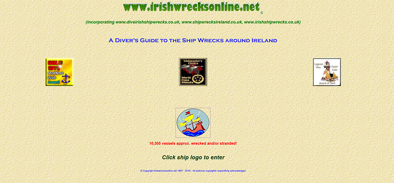
9) Non-functional design
No menus, or menus that don’t function properly are a waste of everyone’s time. If people can’t find the information they’re looking for, your website is worthless to them … and to you. (Irish Wrecks – ironic name, isn’t it? And please do notice their “World Class Website” awards … )
10) Sorry … What do you do?
Have you ever been left scratching your head wondering exactly what is it that they’re selling? When you visit a website, you should immediately be able to figure out the nature of the business. People want to know that they’ve come to the right place. If they’re not sure, they will move on and you will lose out simply because you didn’t make it clear that they were, in fact, in the right place. (ClickOnThings)
If your website is falling victim to any of these symptoms, you may need the services of a professional website designer. As always, my first advice is to check out your competition and other similar websites. And then compare them to your own. If looking at a website makes your eyes hurt or your stomach turn, it probably needs some professional help.


