Mobile Web Design & Development
Windsor, Essex County
Mobile Friendly Web Design is Critical
We use responsive mobile web design for many of our Windsor and Essex County website development projects. That’s because over 50% of user are accessing the internet with mobile devices. In fact, worldwide, mobile devices presently outnumber desktop computer usage 20-1. The increasing number of mobile connected customers provide many opportunities for increased traffic. To take full advantage of internet traffic growth, a responsive mobile friendly web site is essential.
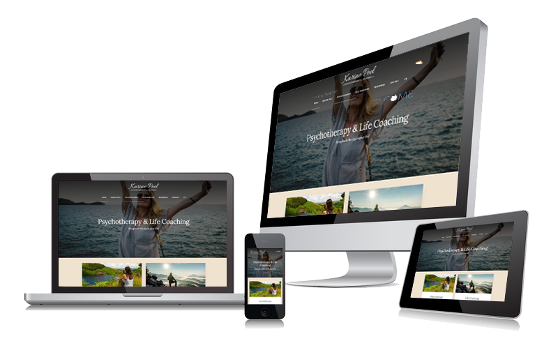
What is a Responsive Mobile Friendly Website?
A responsive web design means your website is developed to automatically adjust for different screen sizes, that include portable computers, laptops, notepads, and of course, mobile phones. A responsive web design offers your viewers easy navigation and reading without having to scroll and zoom. A well designed mobile friendly website easily resizes and alters itself to perfectly fit the page layout of the device it’s being viewed on.
Benefits of Responsive Mobile Design
1) Attract a Larger Audience
A responsive mobile web design gives your audience greater access to your website as it can be viewed on various devices, large and small.
2) Easier Maintenance
Making changes to multiple websites for multiple devices is a lot of work. With a responsive website you make the change once to be displayed across all devices.
3) Easier Monitoring of Analytics
Rather than having to monitor analytics of websites designed for different devices, a responsive website makes this easy as it is just one website.
4) Boost Your SEO
Google drives 96% of mobile search traffic and recommends responsive design as a best practice. Because Google favours responsive websites, they will appear higher on the search engines results.
5) Branding Consistency
Trying to work with various websites makes it difficult keeping your branding design consistent. A responsive website means your site’s look and feel will be the same across all devices.
6) Lower Bounce Rates
If your website isn’t compatible with the device your audience is using, they will quickly (bounce) move on to your competitor. A responsive website will reduce the bounce rate with better viewing, smarter navigation, fast loading, and clear call-to-actions.
7) Higher Conversion Rates
A Responsive web design generates higher conversions across desktop, tablet and mobile devices.Responsive websites reach a much larger audience and provide a smoother and easier user experience.
Is My Website Mobile Friendly?
There’s an easy way to find out! Google provides a Free Mobile Friendly Test. Just click on the link below and enter your website address. Within 30 seconds, Google will display test results on whether your website is mobile-friendly.
If your website is not mobile friendly or if you would like to upgrade your site to be a fully responsive website, we can help. Our mobile website designers have developed hundreds of website projects to small and medium size businesses throughout Windsor, Lakeshore, Leamington, and other areas of Essex County. We also serve the Chatham Kent region, as well as clients throughout Ontario, Canada, and the USA.
Mobile Apps
Sometimes, a responsive website is not enough. Mobile apps can allow your customers to access their accounts, perform tasks and keep up to date on news related to your website without having to search for and access your website every time. A local veterinarian may have an app to remind you of an appointment for your pet. A restaurant could supply an app for advanced take-out orders to on-the-go diners. Using mobile development to add simple conveniences to your business ensures that your clients will be return customers.